Dispatch
The Challenge Space
To evaluate the usability of Dispatch’s current mobile app for its delivery drivers and propose recommended app changes to Dispatch’s product team in a 1-week sprint.
Dispatch is a B2B marketplace delivery business that serves the Minneapolis-St. Paul area and over 20 other cities across the U.S.
The Deliverables
An interactive prototype of the driver-facing mobile app with new features and improvements. It enables the delivery driver to quickly select new orders that are in close proximity and better match the driver’s preferences and capabilities. View it here.
TOOLS + METHODS
Tools: Sketch, InVision, Otter.ai, Google Suite
Methods: Cognitive Walkthrough, Contextual Inquiry, User Interviews, Prototype Walkthrough, IA diagrams, Affinity Diagramming, Prototyping
MY ROLE
I conducted a cognitive walkthrough, co-moderated contextual inquiry, created IA diagrams for user flows, wireframed early concepts, and created an interactive prototype. My UX team included 2 other designers/researchers.
Overview
Dispatch is a B2B marketplace delivery business that seeks to connect customers who need to ship a product quickly with an affordable delivery option. It distinguishes itself from other delivery businesses by using technology to provide customers real-time tracking and accurate ETA’s.
Dispatch’s product team approached my UX design team with an interesting opportunity to (1) evaluate the usability of both their current driver-facing mobile app and an in-progress redesign of this app, and (2) to propose meaningful improvements to make the driver’s app more useful for their delivery drivers.
The Users
Dispatch’s delivery drivers use a mobile app to manage their schedule and deliveries. Most of Dispatch’s drivers are independent contractors (IC’s) who manage their own schedule, but there is also a small team of part-time staff drivers employed directly by Dispatch who keep the service running smoothly.
The B2B marketplace business’ logo
Research
Cognitive Walk Through
Given that Dispatch’s drivers must actively engage with the mobile app to find and accept their next delivery order, a cognitive walkthrough was conducted to evaluate the current app’s (and a redesign prototype’s) ease of use. With this method, I assessed whether their cues and prompts help or impede the user from achieving their goals. The results provided some insight on what were the main opportunity areas for the current app and in-progress redesign prototype.
Screenshot of a part of the Cognitive Walkthrough evaluation of the in-progress redesign prototype.
On-Site User Research
Next, my UX design team moved on to conducting on-site research with Dispatch’s drivers. Using a combination of contextual inquiry, user interviews, and prototype walk-throughs with 2 Dispatch staff drivers and 1 independent contractor, my team and I seeked to understand how they use the current app and what are the pain points and opportunity areas for the current app and the re-design prototype.
Conducting contextual inquiry during a ride-along delivery run with a staff driver.
Design team members conducting a prototype walkthrough evaluation with a staff driver.
Synthesis
After we finished conducting research, we externalized our findings on Post-it notes in order to synthesize insights. Based on our findings, the key insights I synthesized and focused on during my design process were:
Drivers wanted to quickly find new orders that are close to their current location.
Type of order and total weight/size of packages were other important factors.
Drivers liked using a Map view to find new orders when they are NOT driving, but preferred a “List” view when en-route.
Drivers reported difficulty with seeing new orders and reading the text in the redesign prototype due to low contrast and small font sizes.
Drivers reported difficulty with way-finding in the app due to low feedback and visibility at times.
List view of available orders featured in the current driver app.
Map of the available orders in the client’s redesigned prototype (but not my work).
Design Ideation
User Goals
With the above insights in mind, I focused on designing improvements and added functionalities that specifically addressed these 2 user goals:
To allow the driver to quickly and easily find new orders that fit their preferences while using their preferred mode of viewing.
To increase the visibility and feedback for the app’s pages that are involved in the selection process of new orders.
Early Prototyping
I began by hand-sketching the low-fidelity wireframes, shown below:
Early, low-fidelity wireframes of my prototype
Information Architecture
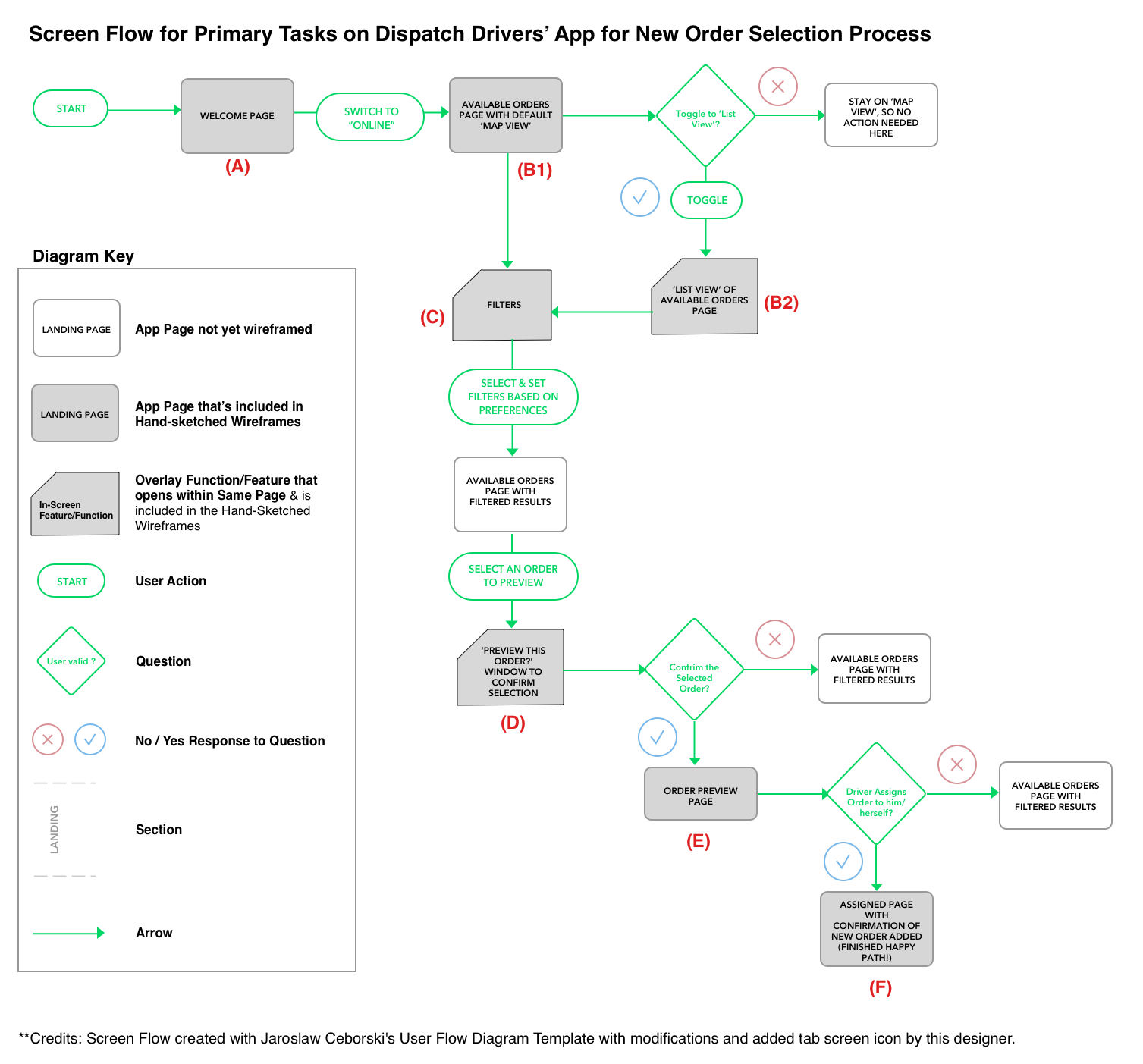
To map out the desired screen flow of the user’s primary tasks with my prototype redesign, I created the following information architecture diagram:
Finalized Prototype
Added Modifications
To meet user goals, I’ve added the following features and modifications to Dispatch’s redesign prototype, as demonstrated in the screenshots below:
The ability to toggle between the Map view or List view based on the driver’s preferences.
The ability to filter available orders by drivers’ 3 main expressed interests: preferred travel distance (from current location to pick up location), type of delivery (ASAP, expedited, standard), and approximate total weight/size of the parcel(s).
Enlarged location pins, buttons, and text with more contrast to increase visibility and readability.
Buttons and prompts to provide more confirmation and feedback to correct or avoid errors.
My Prototype’s Redesigned Home Page
My Prototype’s New Filters Feature
My Prototype’s New Confirmation Message
The Prototype
A static form of my proposed prototype was first developed in Sketch. Then the prototype’s assets were exported and converted to an interactive prototype in Invision. Screenshots from the proposed prototype are included above. To view an Invision tour of this prototype and interact with it, click on this link: https://invis.io/RWTWAT9FZSK#/384000796_Intro_Page_1 Below is a video walkthrough of this interactive prototype:
Impact
By incorporating the proposed recommendations above, this would allow Dispatch’s drivers to quickly make informed assignments of orders that better fit their preferences and capabilities. It also reduces cancelled orders that arise from errors or mismatches that arise from selecting orders that drivers are unable or unwilling to fulfill based on type of delivery or weight/size. For example, a driver may not have the equipment to safely transfer a package that’s heavier or bulkier than normal.
Thank you Dispatch for this opportunity to work with you!


